Red is a powerful color that can instantly transform the look and feel of a workspace. When applied correctly, a well-planned red office design not only creates a bold visual impact but also enhances energy, creativity, and brand identity. From accent walls to furniture and functional zoning, there are many ways to incorporate red effectively without overwhelming the space. Find more red office design ideas with OSCA Asia.
Contents
1. Best Ways to Incorporate Red in Office Design
Red is a bold, energetic color that can transform any workspace when applied thoughtfully. Below are the most effective ways to integrate red into your office interior.
Red accent walls
Creating a red accent wall is one of the simplest yet most impactful design strategies.
- Helps establish a strong focal point in meeting rooms or collaboration areas
- Adds depth without overwhelming the entire space
- Works especially well in black white and red office decor, where contrast creates a modern and professional atmosphere

Red office furniture
Incorporating red through furniture allows flexibility and balance in design.
- Popular options include chairs, booths, and reception seating
- Easily combined with neutral tones like white or grey
- A key element in red black and white office decor, helping maintain a clean yet dynamic look

Red decorative elements
For a more subtle approach, decorative accents can introduce red without dominating the space.
- Use artwork, wall graphics, or lighting fixtures
- Ideal for branding and visual storytelling
- Can complement themes like red white and blue office decor, especially in creative or global office environments

Red in ceiling or architectural features
Using red in structural elements creates a unique and contemporary office design.
- Highlight exposed pipes, beams, or ceiling structures
- Adds an industrial and creative edge
- Enhances open-plan offices by drawing the eye upward and creating visual interest
This approach is perfect for companies looking to stand out with a distinctive red office design while maintaining a balanced and functional workspace.

2. Where to Use Red in Different Office Zones?
Collaboration spaces benefit from red’s energy, encouraging communication and creativity, especially within red black and white office decor schemes.
2.1 Red Reception Area Design
Using red in the reception area helps create a strong and memorable first impression. In a well-balanced red office design, red can highlight branding elements and draw immediate attention, especially when paired with black white and red office decor for a sleek, professional look.
Key technical notes:
- Maintain contrast ratio for visibility and accessibility
- Ensure signage remains readable against red backgrounds

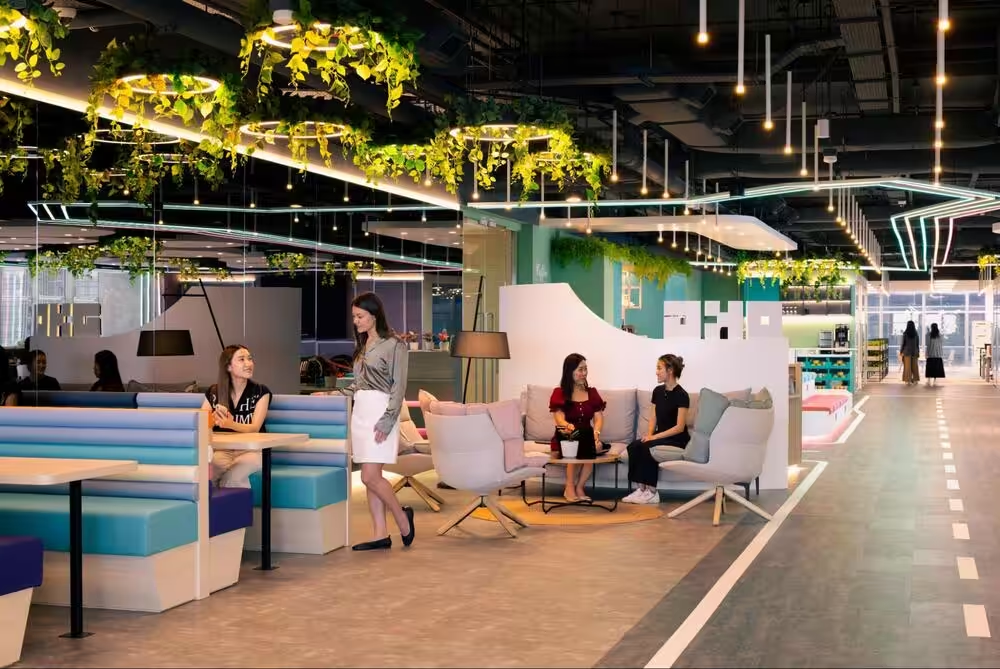
2.2 Red Collaboration Spaces
Red is ideal for collaboration areas as it naturally boosts energy and interaction. In a smart red office design, using red in these spaces can encourage communication and creativity, especially when combined with red black and white office decor for a balanced yet dynamic environment.

2.3 Red Meeting Rooms
Red works well in meeting rooms because it helps keep the atmosphere active and engaging. In a balanced red office design, red accents such as chairs, panels, or a feature wall can encourage participation while still maintaining a professional look.
Technical checklist:
- Screen visibility remains clear
- Eye strain is minimised
- Colour contrast supports note-taking and reading

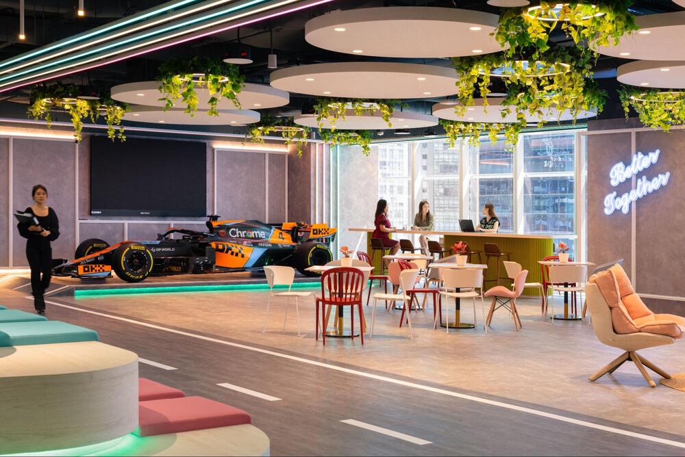
Red is perfect for breakout or social areas where a more relaxed and lively atmosphere is needed. In a thoughtful red office design, it helps energize informal zones and boost mood, especially when combined with softer tones or red white and blue office decor for a more dynamic and creative feel.
Recommended usage:
- 40–50% red in visual elements
- Balanced with natural materials

3. Tips for Designing a Balanced Red Office Interior
To create an effective red office design, it’s important to use red in a balanced and intentional way.
- Use red strategically as highlights: Avoid overusing red, focus on key elements to create impact without overwhelming the space
- Combine with neutral palettes: Pair with white, black, or grey for harmony, especially in red black and white office decor
- Apply red in high-energy zones: Best suited for collaboration or social areas rather than quiet workspaces
- Integrate branding and functionality: Ensure red supports both brand identity and practical workplace needs

| OSCA is a professional office design and build consultancy specialising in delivering functional, high-performance workspaces. With a strong focus on spatial planning and user experience, OSCA provides tailored solutions that align business goals with practical design execution. Each project is approached with a clear methodology, ensuring that every element supports productivity and brand identity.
OSCA’s services cover the full project lifecycle:
OSCA combines technical expertise with a refined design approach, ensuring each office is not only visually consistent but also practical for daily use. The result is a workspace that supports efficiency, enhances employee experience, and strengthens long-term business value. |
A successful red office design requires the right balance between creativity and functionality. If you’re looking to transform your workspace with a bold yet professional approach, OSCA offers expert office design solutions tailored to your brand and business needs. Contact OSCA today to create a dynamic, inspiring office that truly stands out.